As pricing people, it’s appropriate that we focus a lot of our attention on measuring and improving profits. After all, it’s profit that pays the bills, keeps the lights on, and provides fuel for additional growth and innovation.
But as important as those profitability impacts are, you shouldn’t rely on just one dimension of value and contribution. There are many other ways to demonstrate that your efforts are having an impact. And by coming at it from multiple directions, you present a more credible and well-rounded picture.
In a recent interview with Erin Cihak and Peter Bloechle, members of the Customer Value Team at PROS, we discussed a number of approaches for measuring pricing improvement over time, including something they refer to as the “Pricing Discipline Index”.
Now, the idea with this measure is that as you work to improve the underlying processes for delivering prices into the marketplace, guiding salespeople toward better pricing decisions and responses, and so on, your pricing outcomes will become more consistent and less haphazard.
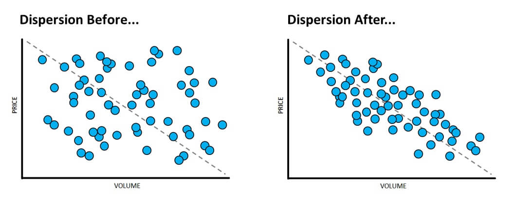
How can you measure something like pricing discipline? Well, one relatively straightforward method is to measure and track the dispersion of realized prices within your price segments. As your pricing process improvement efforts take hold, the realized prices within your price segments should become more consistent and the variation should narrow and tighten up.

As you can see, this is one of those measures that really lends itself to visual presentation. For example, if you presented a couple of before and after scatterplots like these to your management team, you probably wouldn’t have to provide much more explanation at all for everyone in the room to conclude that pricing discipline and consistency has indeed improved significantly.
It’s not a not a silver bullet, to be sure. But it does add another compelling dimension to the overall picture of value and contribution.


